featured work
I'm a multi-disciplinary creative director with a habit of noticing details that others miss.
My work lives at the intersection of strategy & aesthetics – building brands from the ground up, directing campaigns that feel lived-in rather than performed, and shaping the kind of visual language people recognize before they can explain why.
CASE STUDY 01
The Mom Edit Shop
3 years of campaign photography & art direction
SCOPE
Photography + Art Direction
DURATION
3 years, ongoing
CAMPAIGNS
7+ collections
THE BRIEF
The Mom Edit is a beloved fashion and lifestyle destination with a fiercely loyal audience. Their shop needed product photography that felt earned – not aspirational in the untouchable sense, but in the way of a friend with great taste whose home you actually want to spend time in. The work had to move product while reinforcing the brand's core promise: that real, beautiful style belongs to real women.
THE APPROACH
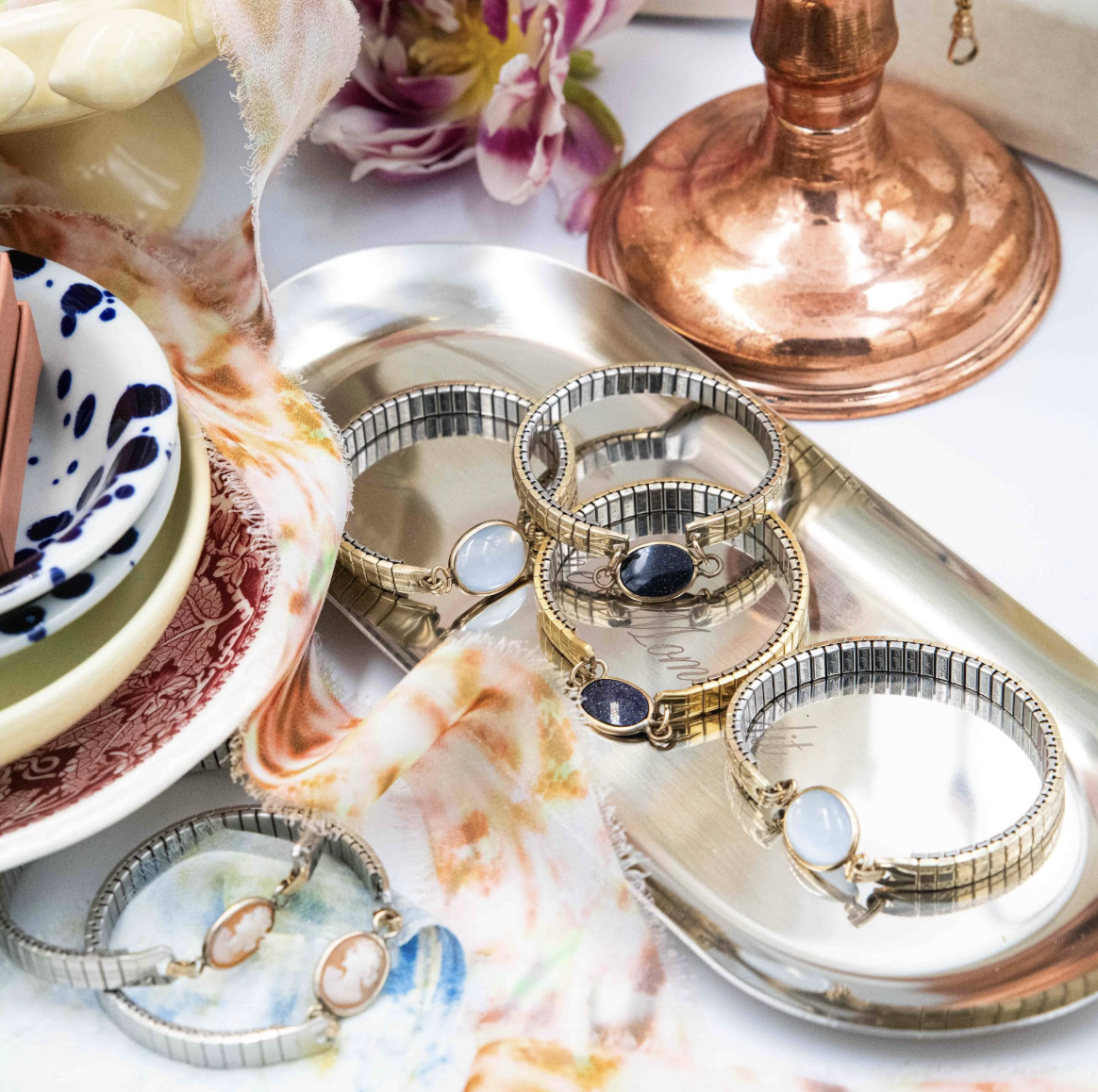
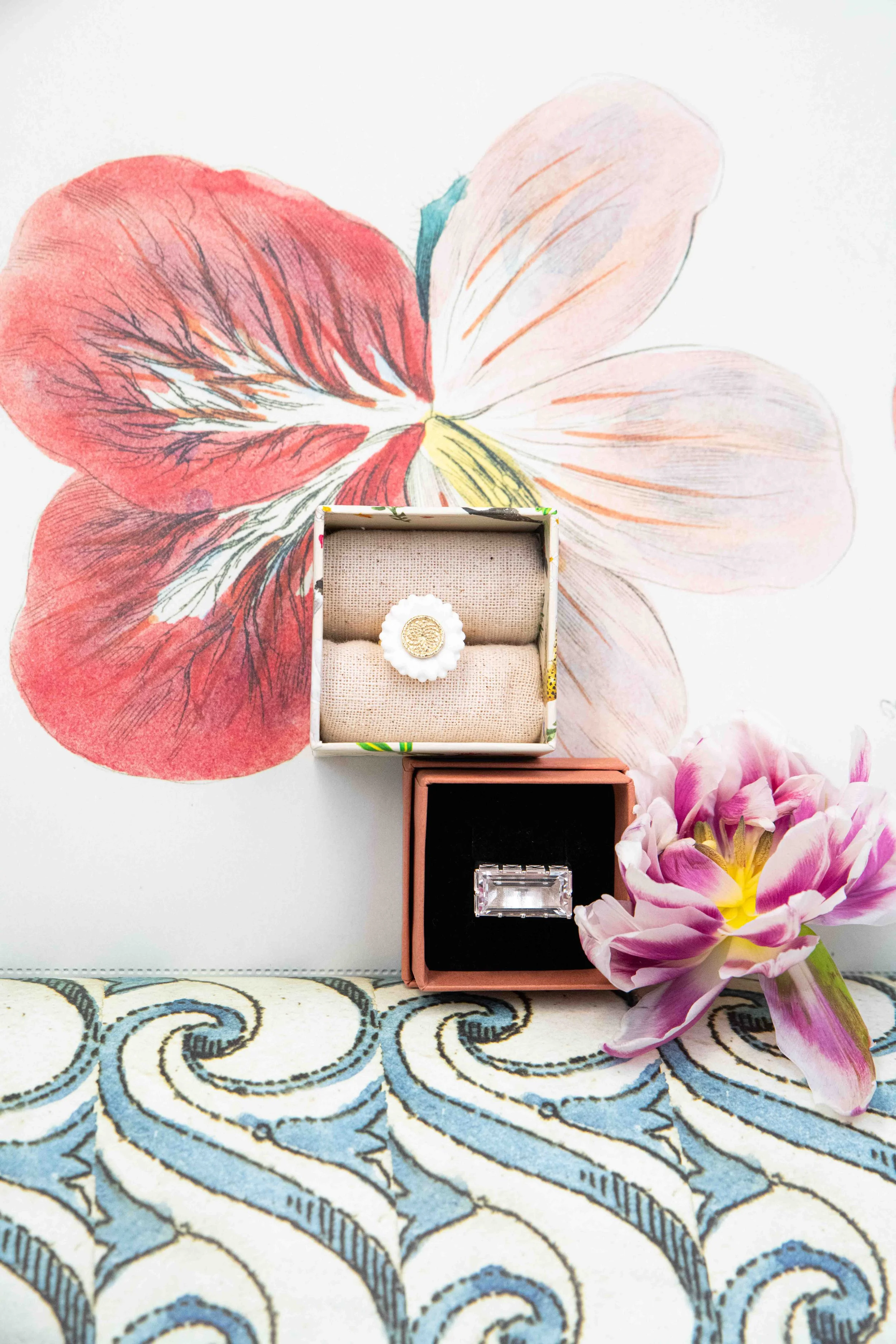
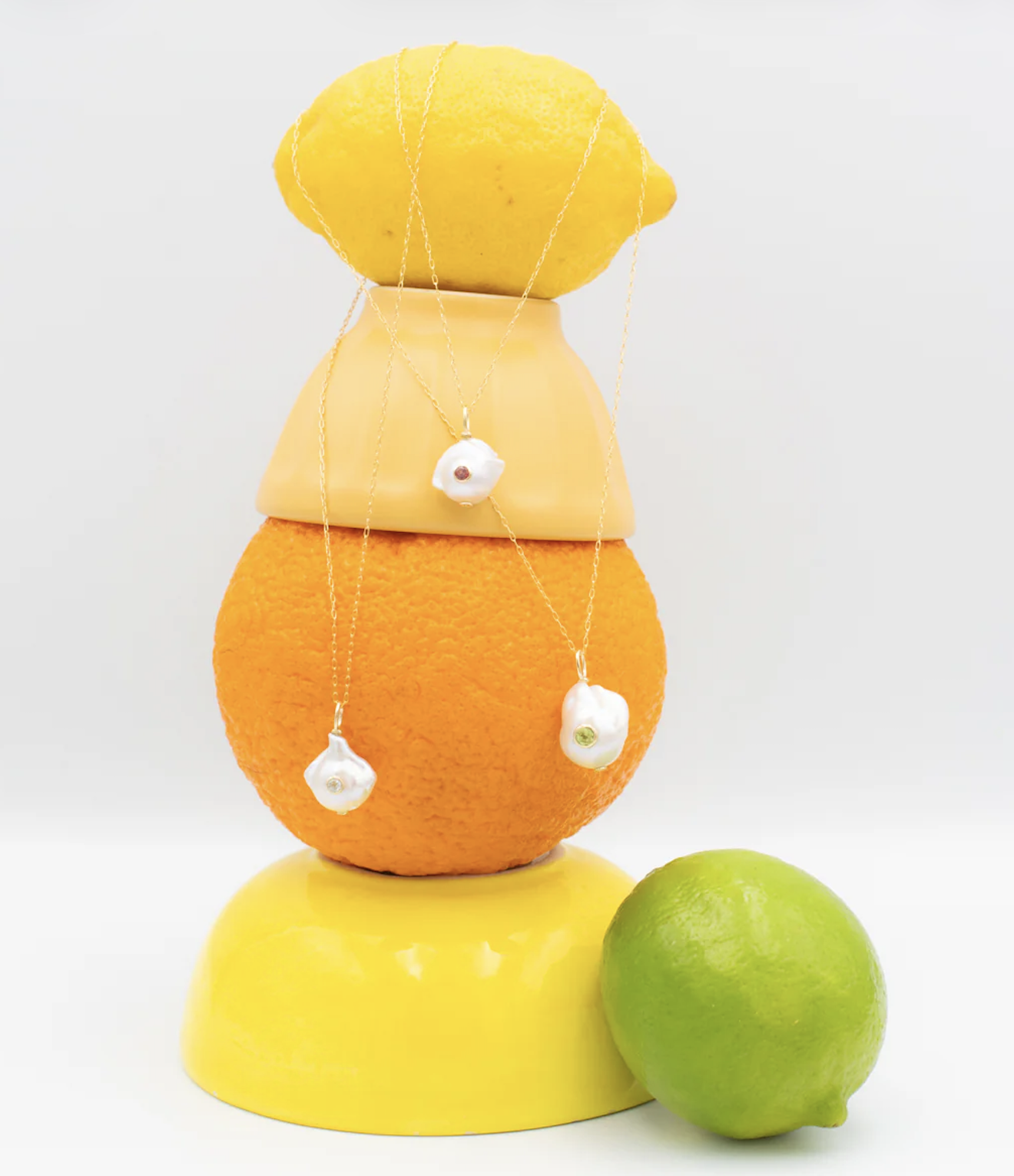
Over three years and across every product category – jewelry, clothing, lifestyle – I've built and maintained a cohesive visual identity for the shop through photography alone. Every shoot is art directed and executed in-house, which means every image reflects a deliberate creative decision, not a default.
The guiding principle: beautiful but believable. Curated like a friend's home, not a storefront.
In practice, that means shooting with live elements – fruit, flowers, ceramics, linen – that suggest a life being lived rather than a set being dressed. It means allowing a little mess when the product calls for it, and pulling back when it doesn't. It means every image communicates use and love, not just ownership.
THE RESULT
A sustained visual language that has grown alongside the brand – recognizable, consistent, and purposefully imperfect. The shop's imagery reflects its editorial roots while remaining approachable enough to convert. Seven campaigns in, the aesthetic has only sharpened.
Art direction / Campaign photography / Visual identity / Product styling / Brand stewardship
CASE STUDY 02
The Mom Edit – 2025 Holiday Shop Campaign
Concept to final selects – full creative direction
SCOPE
Concept, props, direction, selects
OUTPUT
Shop, social, email, blog
PRODUCTION
7 vignette scenes, two locations
THE BRIEF
The Mom Edit's 2025 holiday shop needed a campaign that felt like more than a product showcase. The brief was to create something with a genuine world behind it – imagery that would work across the shop, social, email and blog while stopping people mid-scroll during the noisiest shopping season of the year.
THE CONCEPT
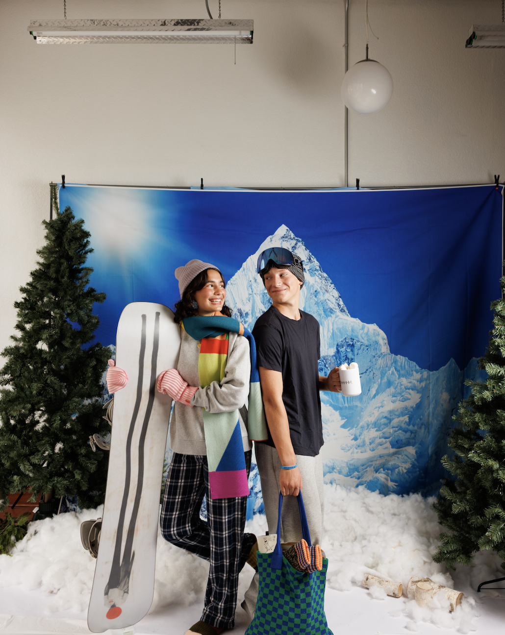
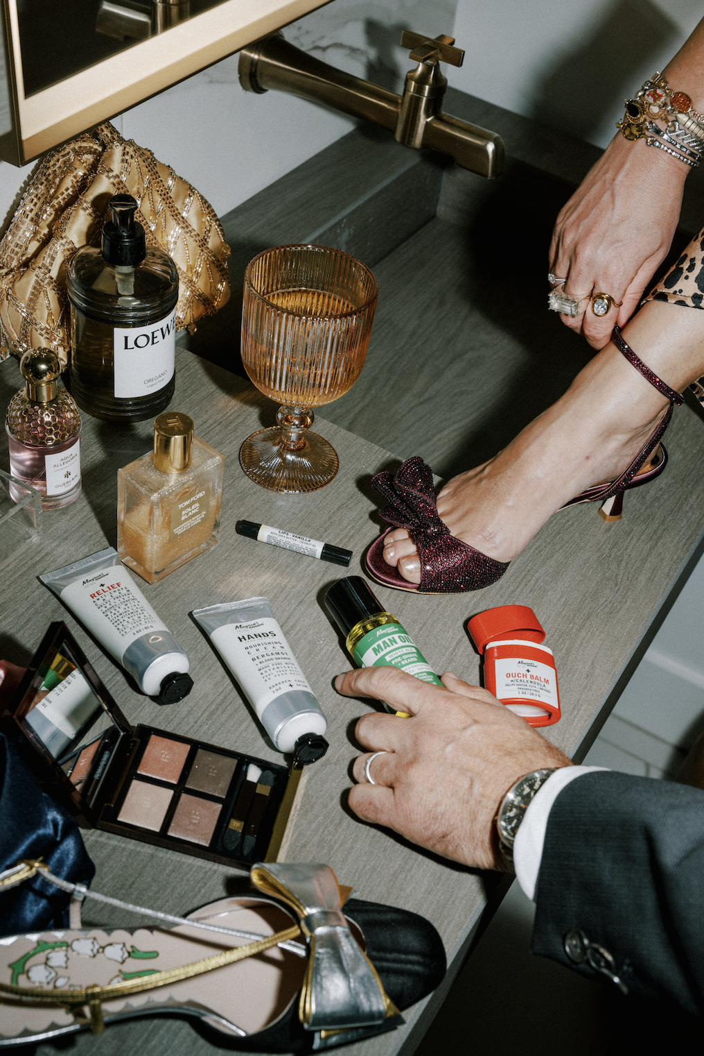
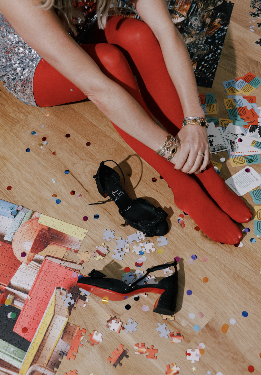
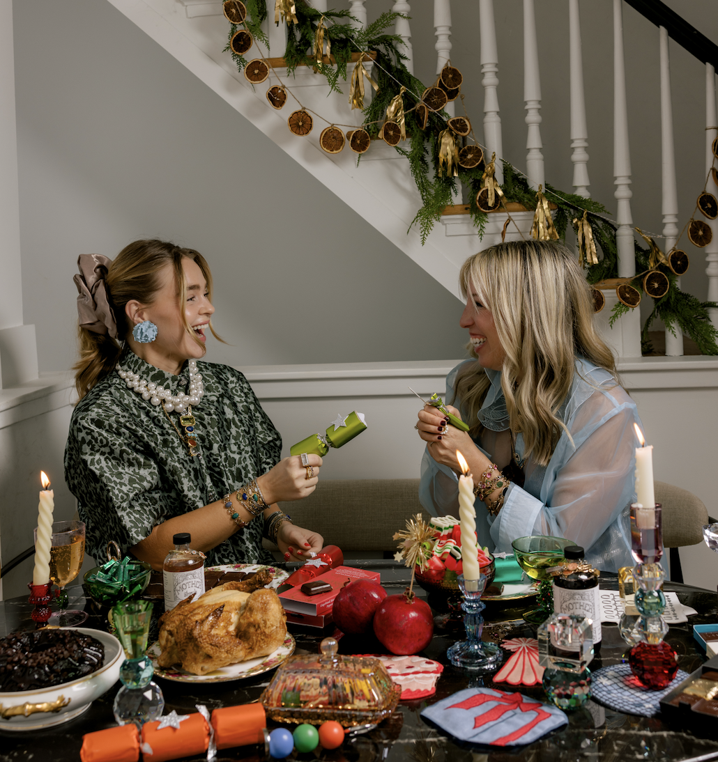
A holiday house party set back in time. Moody, vintage, colorful – the kind of gathering that exists somewhere between a cherished memory and a dream. Flash photography, busy layered imagery, and a warm chaos that makes you feel like you've just walked into the best party you've ever been invited to. The opposite of the clean, minimal holiday aesthetic that saturates every feed in November.
Seven distinct vignette scenes, one house, one studio, one vision – each corner of the space its own world within the same story.
THE EXECUTION
I owned every stage of production. The concept came first – defining the visual world, the mood, the era, and how it would translate into product-forward imagery without losing its soul. From there I sourced and ordered all props and décor, building each of the seven vignette scenes by hand on location. On shoot day I directed on-site, making real-time decisions about composition, light, and styling to protect the integrity of the concept. At the end, I did the photo selection and oversaw final edits – ensuring the images that went out into the world matched the vision that started the whole thing.
THE RESULT
A campaign with a genuine point of view, deployed across every major channel – shop, social, and email – at the height of the holiday season. Imagery that felt art-directed because it was, from the first prop ordered to the last photo selected.
7
VIGNETTE SCENES
4
CHANNELS DEPLOYED
100%
CREATIVE OWNERSHIP
Campaign conception / Art direction /Prop sourcing & styling / On-set direction / Photo selection / Edit direction / Multi-channel deployment
CASE STUDY 03
The Mom Edit
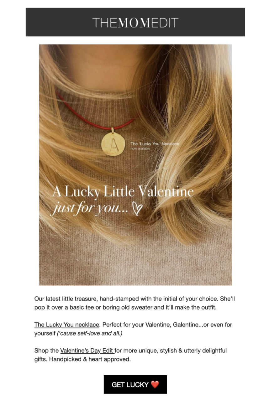
Newsletter marketing direction, copy, owned end-to-end
SCOPE
Newsletter direction & copy, occasional photography
CADENCE
3+ newsletters weekly
AUDIENCE
Women 25–54
THE BRAND
Founded in 2008, The Mom Edit is a major fashion and lifestyle publication serving women 25–54 across style, beauty, travel, fitness, and home. With 5 million annual users, 12 million page views, and $19M+ in sales driven in 2024 alone, it's a real media brand with real stakes – and brand partners including Nordstrom, Saks Fifth Avenue, Adidas, Anthropologie and more.
THE ROLE
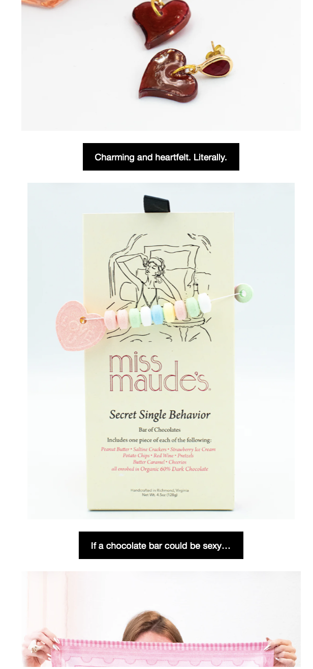
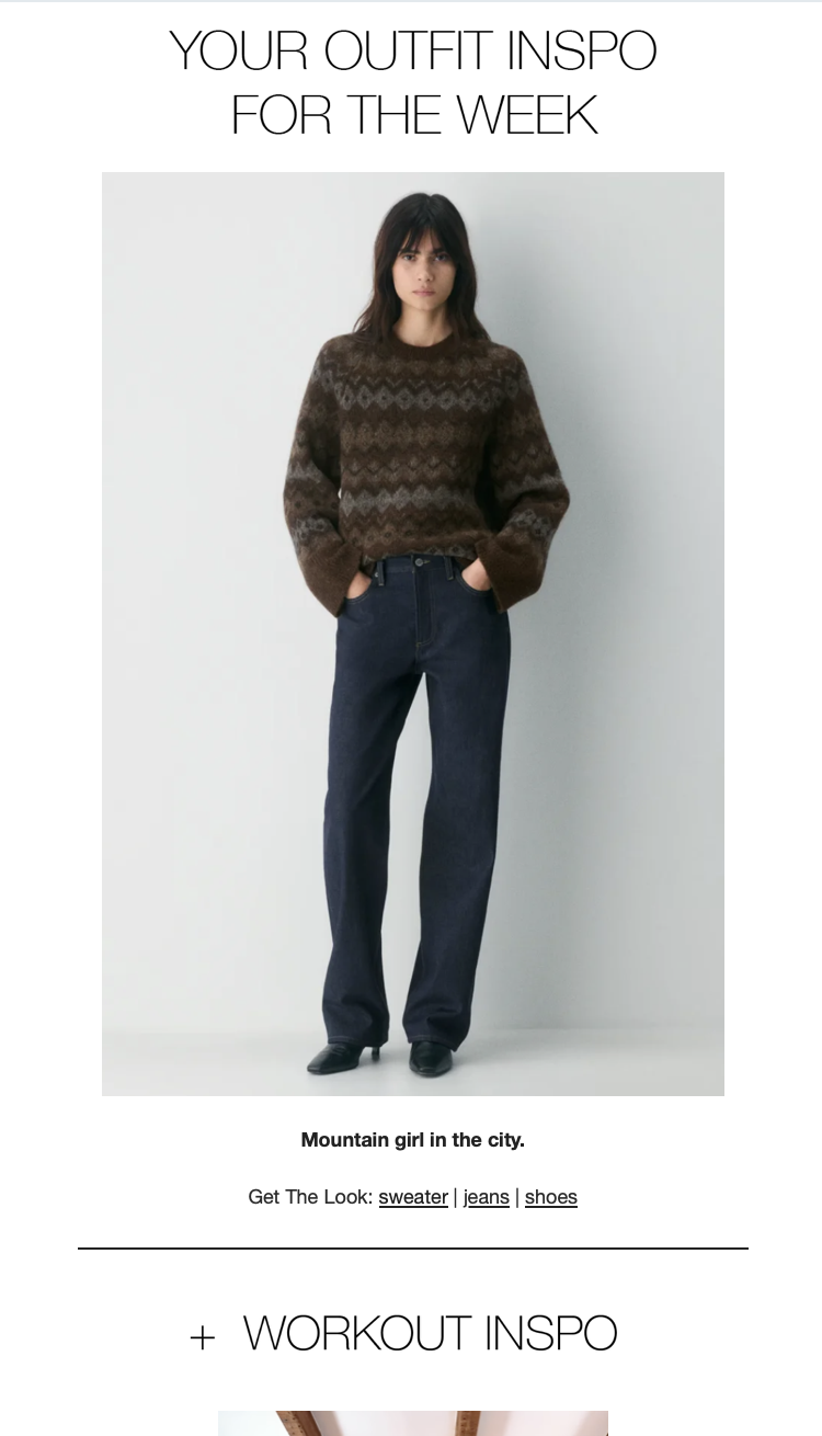
I own the newsletter marketing channel; writing and directing 3+ newsletters per week to a subscriber base of 47,000+ readers. It is the brand's most direct line to its most loyal audience, and every send is a creative decision: what to lead with, how to frame it, what voice to use, what will make someone stop scrolling at 7am or 7 pm and actually click.
SUBSCRIBERS
47K+
SENDS PER WEEK
3+
ANNUAL USERS
5M
SALES DRIVEN in 2024
$19M+
THE APPROACH
The Mom Edit's audience is smart, busy, and deeply loyal – women who have been reading the site for years and trust its voice implicitly. The newsletter has to earn that trust every single time. That means writing that feels like it's coming from a friend with great taste, not a brand with a quota. It means knowing when to be playful, when to be direct, and when to let the product speak for itself.
The brand's mantra: wear what you love, and buy the stuff you actually want to wear. Every newsletter I write is built around that promise.
THE RESULT
A high-volume, high-trust content channel that serves as the brand's most consistent editorial voice – week in, week out, across every season and campaign. Creative direction at scale, in the service of a brand that genuinely matters to the people who read it.
Newsletter marketing / Editorial direction / Copywriting / Content / Brand voice / Audience engagement
CASE STUDY 04
The Mom Edit Shop – Brand Identity & Illustration
Logo design, hand illustration & marketing graphics
SCOPE
Logo, illustration, marketing graphics
OUTPUT
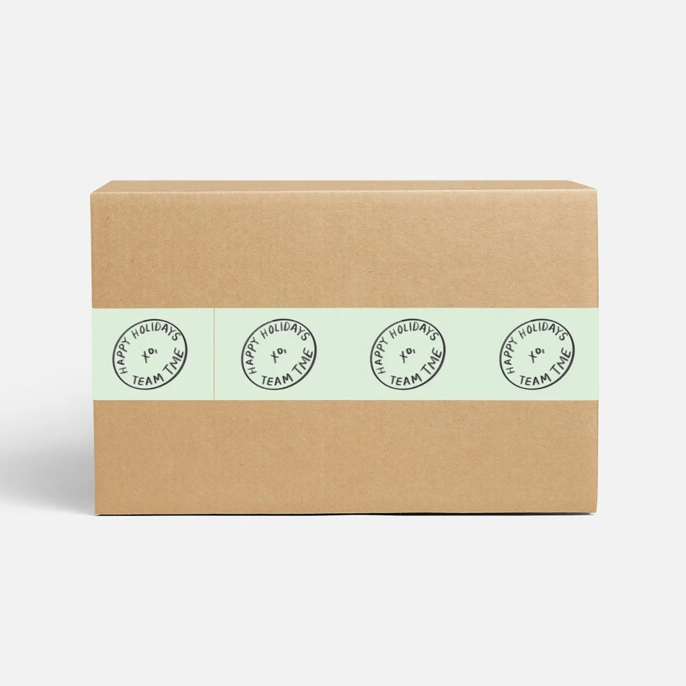
Tape, stickers, thank you cards, social, blog, newsletter
MEDIUM
Hand illustration & lettering
THE BRIEF
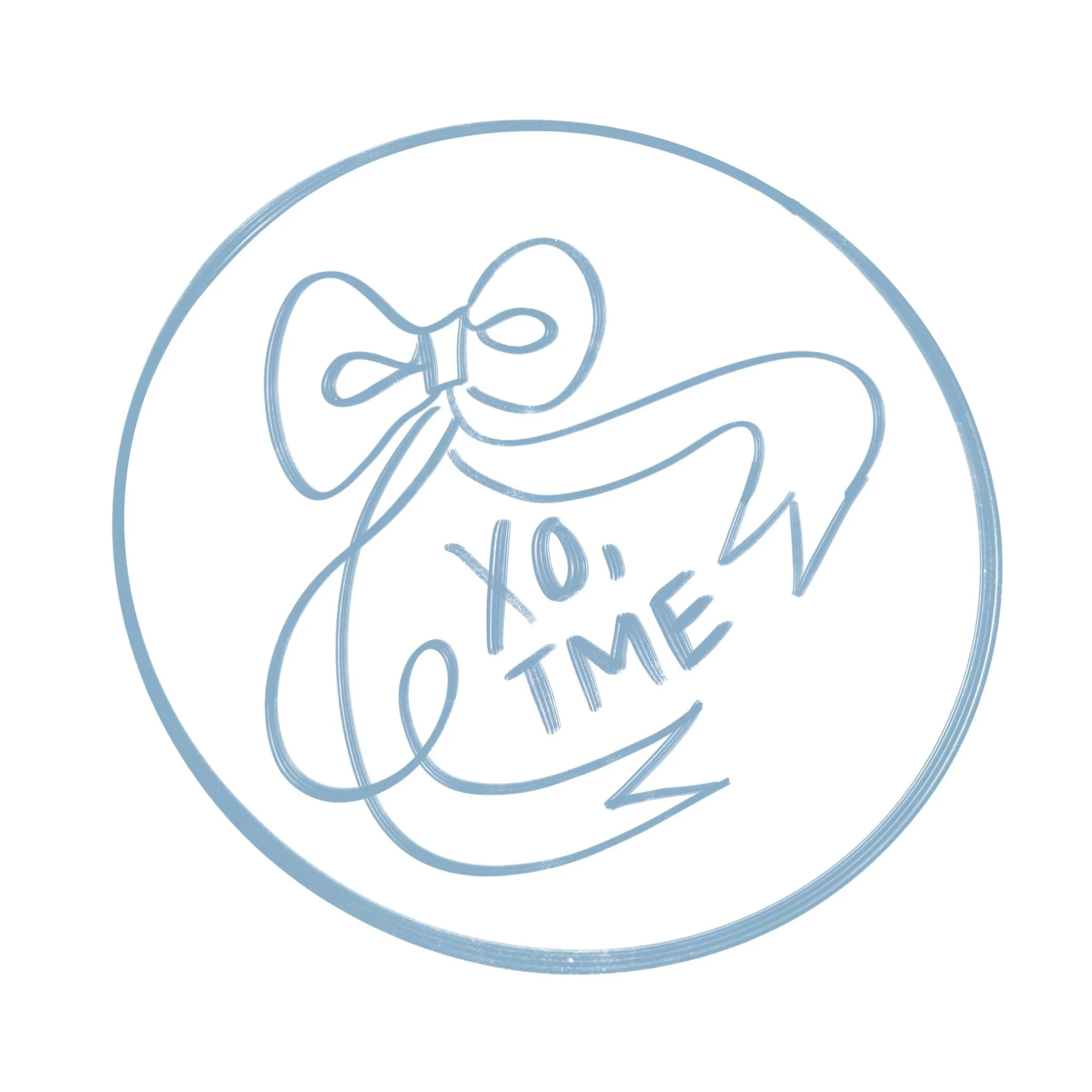
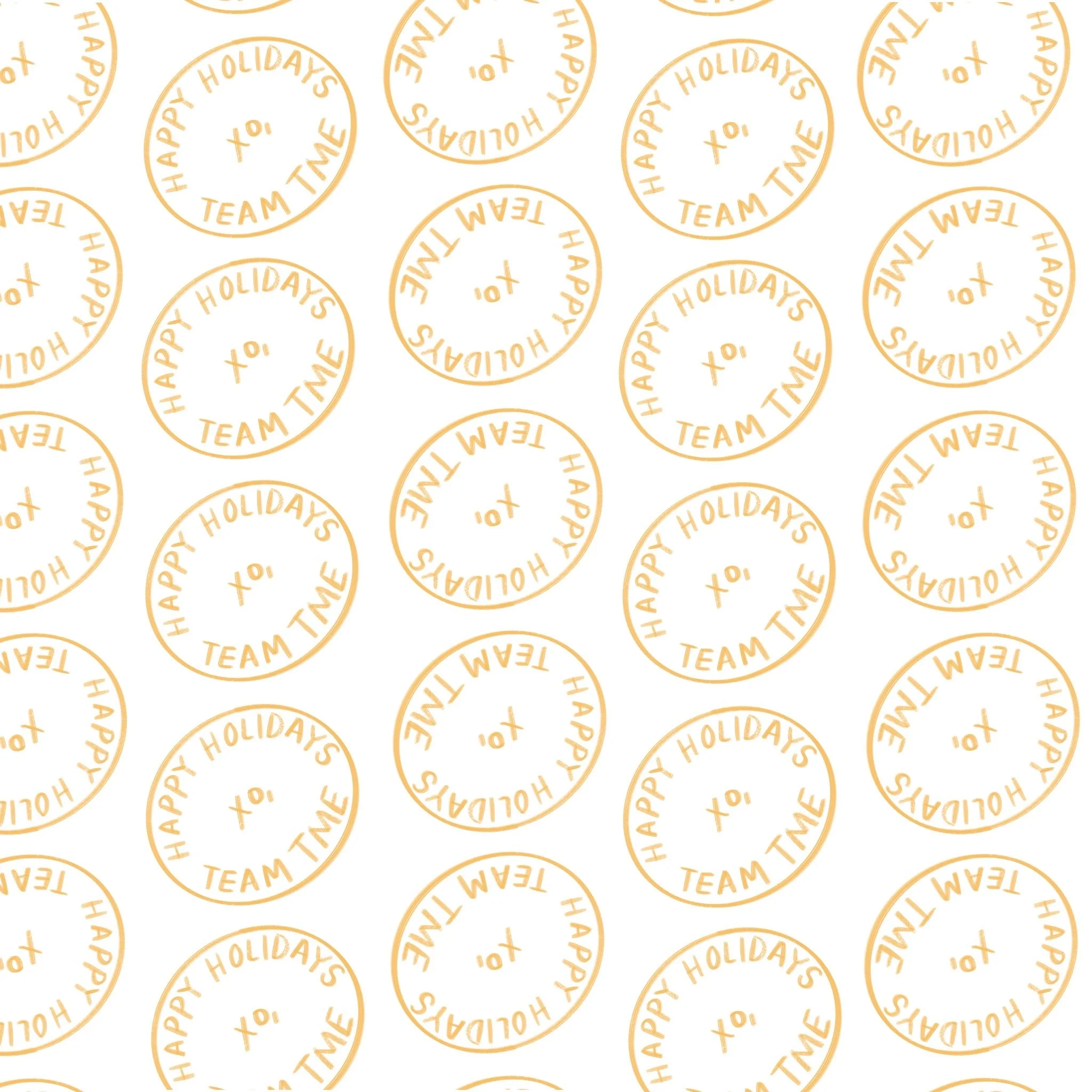
The Mom Edit Shop needed brand marks that felt as personal and considered as the brand itself – not corporate, not templated, but genuinely made. Tape, stickers, thank you cards, and a suite of marketing graphics for social, blog, and newsletter all needed to feel cohesive and unmistakably human.
THE APPROACH
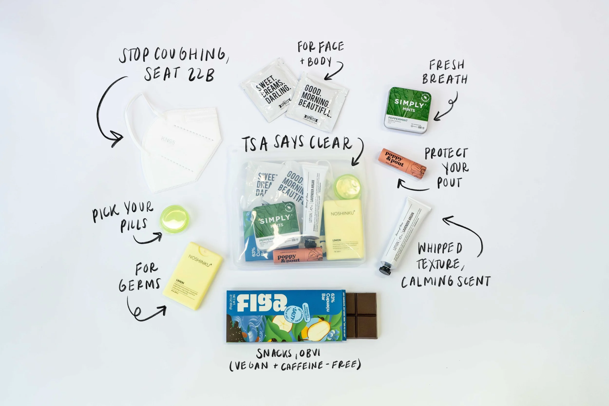
The logo and all accompanying marks were drawn by hand – rooted in my own handwriting and illustration style, which meant every element carried a personal signature rather than a digital default. The guiding principle was the same one that drives all of my work for this brand: beautiful but believable. Polished enough to feel intentional, loose enough to feel alive.
When a brand's identity is drawn by hand, it doesn't just look different – it feels different. That warmth is the whole point.
The illustration work extended across marketing channels – social posts, blog graphics, and newsletter imagery – creating a visual thread that connected every customer touchpoint with the same handmade warmth. Nothing felt like it came from a stock library, because none of it did.
THE RESULT
A brand identity system rooted in authorship – marks and graphics that are recognizably, distinctly The Mom Edit Shop, and just as recognizably made by a human hand. The kind of branding that makes a customer smile when the package arrives.
Logo design / Hand lettering / Illustration / Brand identity / Packaging design / Marketing graphics / Social assets
CASE STUDY 05
C-Screen
Full rebrand – identity, copy, tone of voice & website
SCOPE
Brand Identity + Web
YEAR
2024
DELIVERABLES
Logo, copy, site build
THE BRIEF
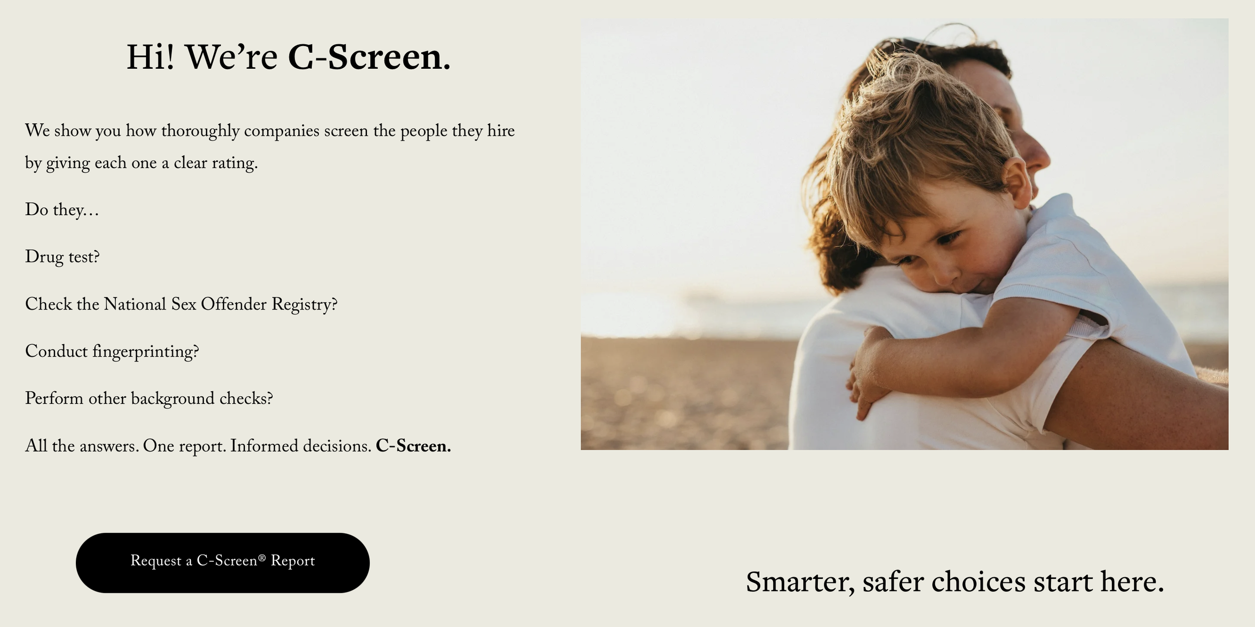
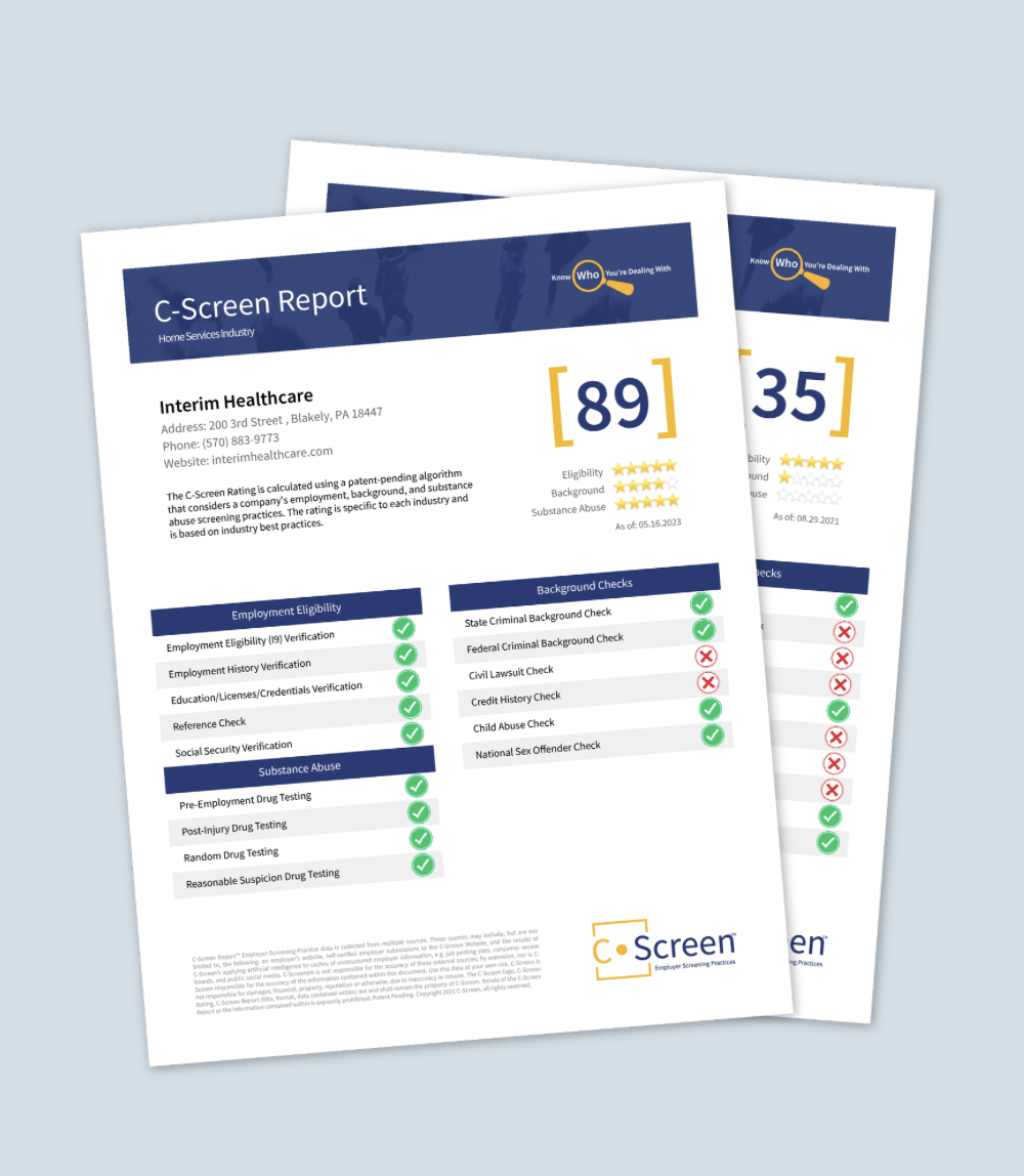
C-Screen rates companies on how thoroughly they screen the people they hire – a service that exists at the intersection of safety, trust, and transparency. When I came on board, the brand had no cohesive identity: the website was barebones, the copy was unclear, and there was nothing to signal to a first-time visitor that this was a product worth trusting with something as important as their family's safety.
THE CHALLENGE
Safety-focused brands live or die by their credibility. The design couldn't be clever for its own sake – it had to earn trust in the first five seconds. That meant resisting the urge to make something that looked interesting, and instead making something that felt immediately clear.
"I put myself in the shoes of a client looking for help, not a person necessarily looking to appreciate art."
THE APPROACH
I developed the logo, tone of voice, and all copy from scratch, then designed and built the website end-to-end. The brand needed to feel like a welcoming, concise place – somewhere both industry leaders and everyday families could arrive, understand the product quickly, get their questions answered, and know exactly how to take the next step.
Every copy decision was made through the lens of the user's emotional state: someone who is worried, looking for reassurance, and pressed for time. The visual identity follows the same logic – clean, direct, and warm without being soft.
THE RESULT
A brand built from nothing that communicates trust at a glance. The site now serves multiple audiences – insurance, childcare, elder care, education, government – with a single, coherent voice that speaks to all of them without losing clarity for any of them.
Brand identity / Logo design / Tone of voice / Copywriting / UX writing / Website design / Build / Concept to launch